Hertz 3 | Dictionary of Earth
The Challenge | Dictionary of Earth
NASA Collectible Cards
A collectible card for every important jargon term / Card sets to be available both to NASA employees and general public / A card collecting and trading/exchanging culture to promote learning about everything NASA-related / Card sets as gifts and awards

For this challenge, we designed a NASA Collectible Card concept, including four designs as proposed by the concept, to demonstrate card look&feel.
Solution overview:
For every important jargon term, a collectible card should be created, with a picture and a short textual description of the term in question. Collectible card sets should be available to NASA employees everywhere on their workplaces and on the places where they spend time during their work and break/lunch time – book shelves, restaurants, bars, coffee shops...
The idea is to promote the card sharing, collecting and trading culture among NASA employees and general public, while benefiting from the fact that people will learn and memorize jargon more efficiently and with less effort while just manipulating the cards and looking at them – we know that for all mammals playing is the best way to learn and adopt skills, and we inevitably associate collectible cards with playing.
People would browse the cards, and after several times they see them they should be able to memorize their content.
Card sets should contain different cards, mixed in more or less random manner. NASA should sell (via web shop) or give away the whole sets with different number of cards, and people might trade single cards between them.
A separate designer community should be organized, probably on a dedicated Web Forum, where new cards should be designed and discussed by the community, before submitting them to NASA for approval and printing.
Solution Details:
Proposed general card design:
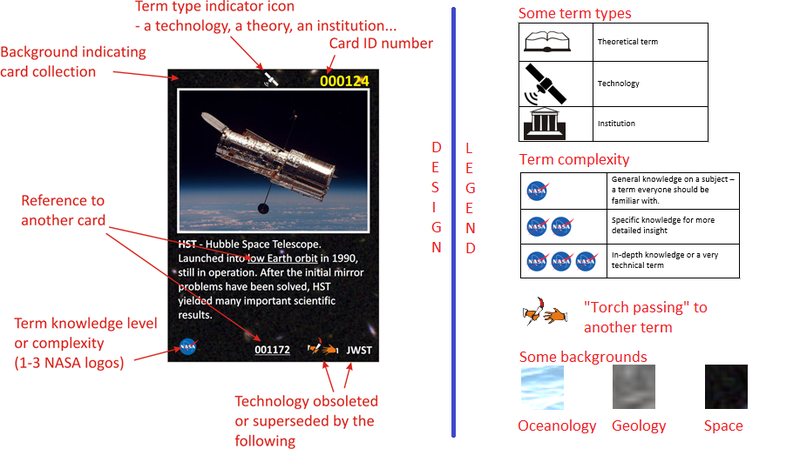
1. Cards should be the standard trading card size: 2.5 x 3.5 inches (64mm x 89mm).
2. Card should be marked with their serial number in a collection, and the year of printing.
3. Card background color should indicate the collection that the card belongs to. For example:
- Black with stars for space and spaceflight-related terms;
- Light blue with clouds for airflight technology;
- Sea or darker blue background for sea and ocean exploration terms;
- Green for environmental and ecological terms;
- Grey or rock texture background for geology, etc...
4. A special indicator on cards should denote the term type – whether it describes an organisation, a technology, a theory...
Indicator icons should be on top of cards, visible and suggestive enough.
5. Cards should be marked with a sign describing the level of subject knowledge necessary for understanding the term. Maybe we could use the NASA logo for this purpose.
6. Cards describing obsolete or historical term or technology should also be marked in a way that points to a card containing the new term or technology. Here we suggest a “passing the torch from hand to hand” icon for this purpose.
7. Text on a card may contain references to other card-implemented terms. We suggest these inline terms to be underlined – in the manner of hypertext links.
8. Cards for terms having homonyms should be also marked - our sugggestion is an asterisk in the top left corner.
Issues during concept creation:
We had two issues with card design:
1) Dealing with homonyms - same spelling, different meaning. We decided to place an asterisk to the top left corner of cards that have homonyms. In our design, a LEO card has a homonym, because LEO stands for Low Earth Orbit, and also for Librating Equidistant Observer.
2) Dealing with cards that represent obsolete or superseded terms, yet important enough to be card-implemented. We decided to draw a torch-passing icon as a very appropriate symbol for such terms. This icon can be visible on both Hubble and NODC cards in our design proposal. Torch-passing icon is followed by a term denoting superseding or replacement for the original term.
List of resources used:
For card designs, we used images and backgrounds from Creative Commons, or those found via Google Image Search and labeled with "reuse with modification" usage rights (Hubble photo, Space, Ocean and Rock card background).
From NASA web sites, we used NASA logo and Low Earth Orbit graphic.
From Geology.com we used the Fault graphic and partial description.
From NCEI Web site we used the NODC logo and partial description.
6 year old Iva Mandic from Trebinje featured in video, with permission of parents.
Hertz 3 Team members:
Ranko Mandic
Veselin Savic
Branislav Trninic
We are three long time friends and software developers from Trebinje, Serb Repulic/Bosnia and Herzegovina.
SpaceApps is a NASA incubator innovation program.